Give Memento Expanding into Desktop
Client Information
Memento is a mobile application that personalizes digital cash gifting for special occasions. Born from an idea from the founders Chelsie Patterson & Jeff Borders while attending a wedding and scrambling for a check for the event gift, Memento was realized. The key differentiator from other digital money transfer applications is the ability to give users a way to send a very personalized and meaningful video message along with the monetary gift. The application is secure, convenient and eradicates the need for checks as well as the tacky monetary transactional feel of cash or digital gift cards.
Challenge
For 8 weeks, I've worked with a design team that consisted of three members to complete Memento's main project request. The project was primarily focused on the translation of the live mobile screens into a desktop application that aligned with the current brand and user experience. In addition to high fidelity desktop screens, a clickable prototype and design system was delivered to aid in future initiatives.
Team Members: Aviva Love & Kathy Hong
Timeline
Month 1
Week 1: Kickoff Memento Meeting & Exploratory Research
Week 2: Divergent Style Tiles & User Interviews (Round 1)
Week 3: Design Principles
Week 4: Wireframes & High Fidelity Prototype (Round 1)
Month 2
Week 5: User Interviews (Round 2)
Week 6: Microinteractions
Week 7: High Fidelity Prototype (Round 2)
Week 8: User Interviews (Round 3)
Exploratory Research & Competitive Analysis
Cash App
Venmo
Zelle
Emerging Trends
Quantitative & Qualitative Data
The idea of asking for money for a gift seems tacky, but asking to crowdfund a trip or experience flips the narrative and makes the situation feel more tasteful
Cash gifting is gaining more traction as Americans tend to marry later and are faced with more financial difficulties such as rising home prices and student loan debt
The gift card market is forecasted to reach $550 billion by 2024, 71% of consumers surveyed report they are interested in digital gift cards vs other gifts.
In 2019, a survey performed by Zelle found 84% of respondents prefer to receive money over physical gifts for life events
Style Tiles
Fruitful Occasion
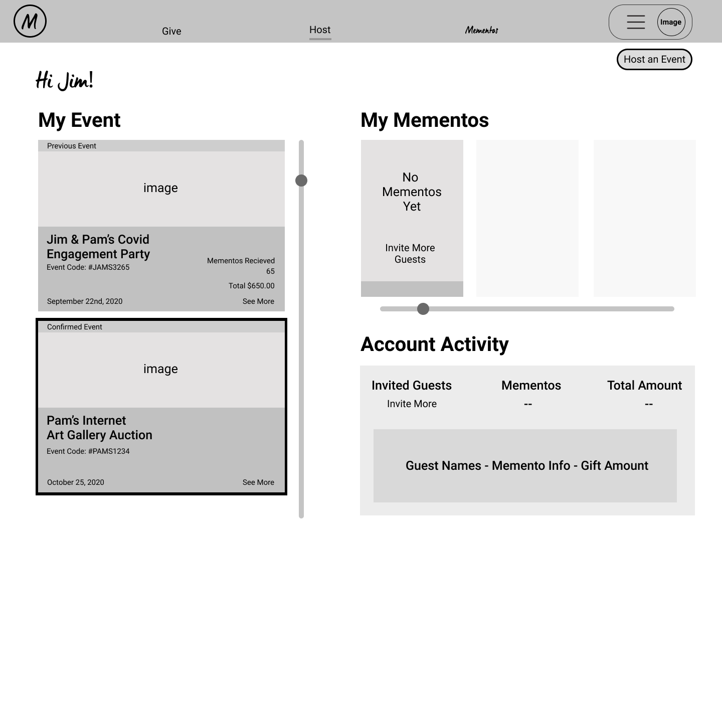
This color scheme aligned more closer with the existing mobile app. Utilizing only a vertical scrolling capability hints that there is an existing mobile app available. The host could also organize their events by color coding it.
Elegant Moments
This design was focused on the guest perspective on using Memento. The users could see an event gallery and they could view the invited guests. The color scheme was leaning towards sophisticated and professional.
Sweet Memories
This design utilizes both horizontal and vertical scrolling capabilities. The user could view specific Mementos individually on a wider screen. Also, the host could know which event is “live” by the bright green bar on top of an event.
Design Principles
Flexibility & Efficiency
We aimed to optimize navigation to help people achieve their desired goals with minimal effort.
Clarity
Eliminated ambiguity. We strived to make our platform straightforward and self-explanatory to enable users to act with confidence.
Personal
Elements were crafted with care and intention for the users to feel invited and joyful in their experiences.
Visualization
Used visual treatments such as grids, space, scale, and imagery to engage the users to experience videos, messages, and curated media.
1st Round of User Interviews
Purpose
5 participants were interviewed to gain feedback from participants about the readability and desirability in using this style tile as Memento's desktop platform.
Overall Takeaways
More emphasis on sending Mementos and less focus on the money transaction. The use of script text is a nice element to make it feel welcoming. Explore more concepts on how to inform the users that hosting an event means collecting monetary gifts.
Positives
The overall format was easy to follow and it looks like a social media thread. The icons were readable and straightforward
Negatives
The "#" wasn't clear that it was the event code and white font against the blue background was hard to read. It wasn't clear enough that this was for the Host and the vertical format was more of a mobile platform.
Takeaway Comments
Doesn't look like a website more of a mobile app. There should be an option to add a goal amount so it gives more initiative to send more money.
First Meeting with Memento
I conducted a workshop called Rose, Thorn, & Bud with the Memento clients to gain feedback on our team style tiles and narrow out the best type of style tile. In the end, they enjoyed all three of our style tiles and they wanted to incorporate all of our styles together.
Kathy Hong
Rose ⇲
Easiest to read and understand
Thorn ⇲
Mix of a marketing page and a home screen page
Bud ⇲
Different navigation style for the menu could be explored
Vidal Nikko Luchana
Rose ⇲
Feels lighthearted and colors compliment each other well
Thorn ⇲
The icons were unclear and the text wasn’t readable
Bud ⇲
Visual hierarchy and overall look could be improved
Aviva Love
Rose ⇲
Very clear and good use of negative space
Thorn ⇲
Use-ability should be easy for new users
Bud ⇲
This could be improved by focusing on giving Mementos
Wireframes
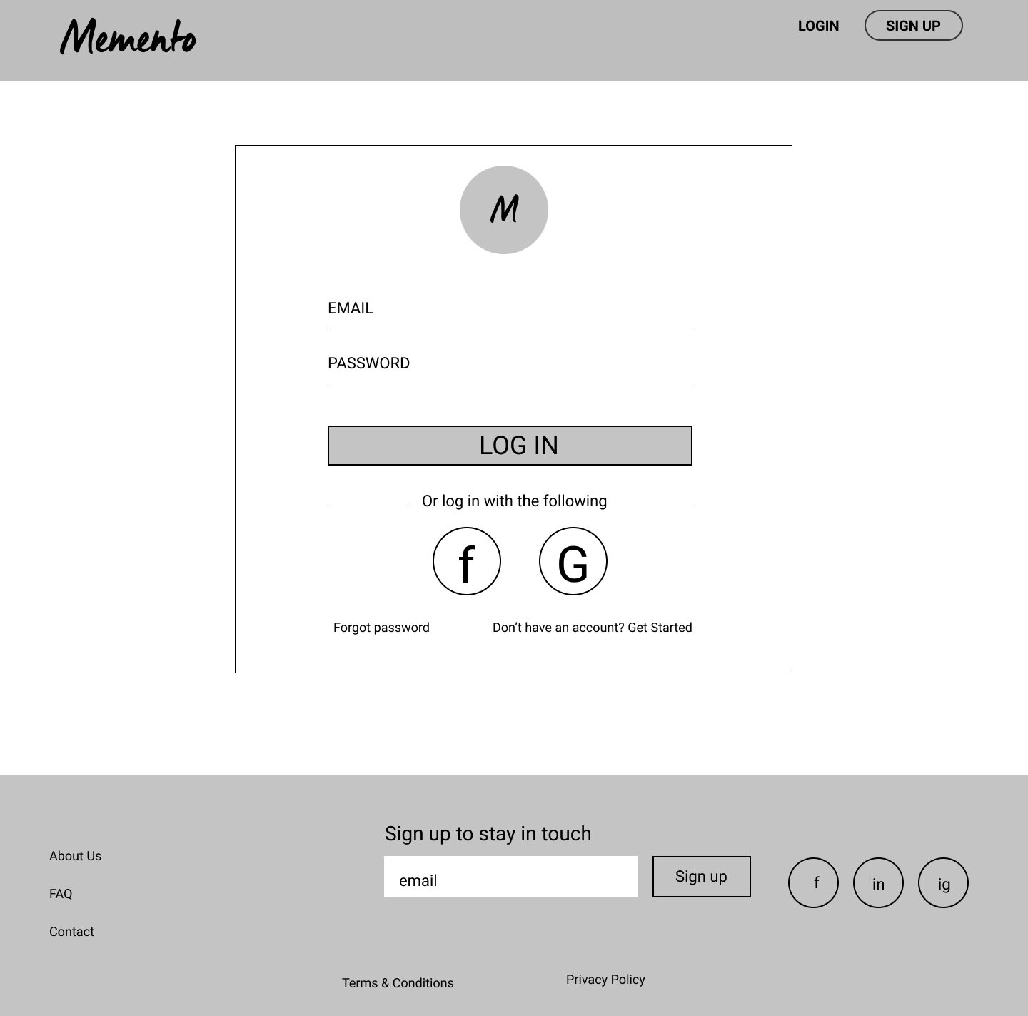
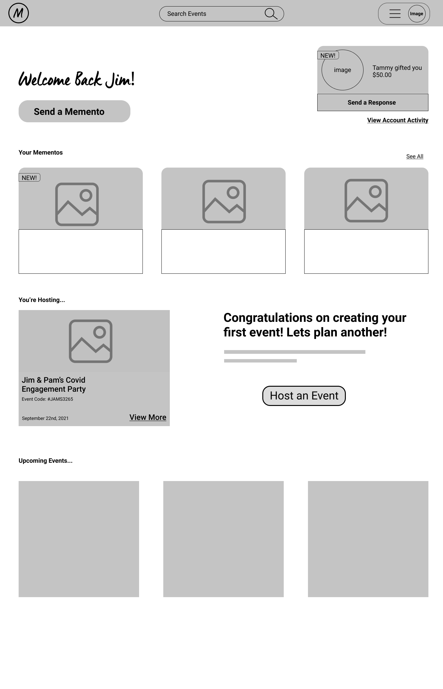
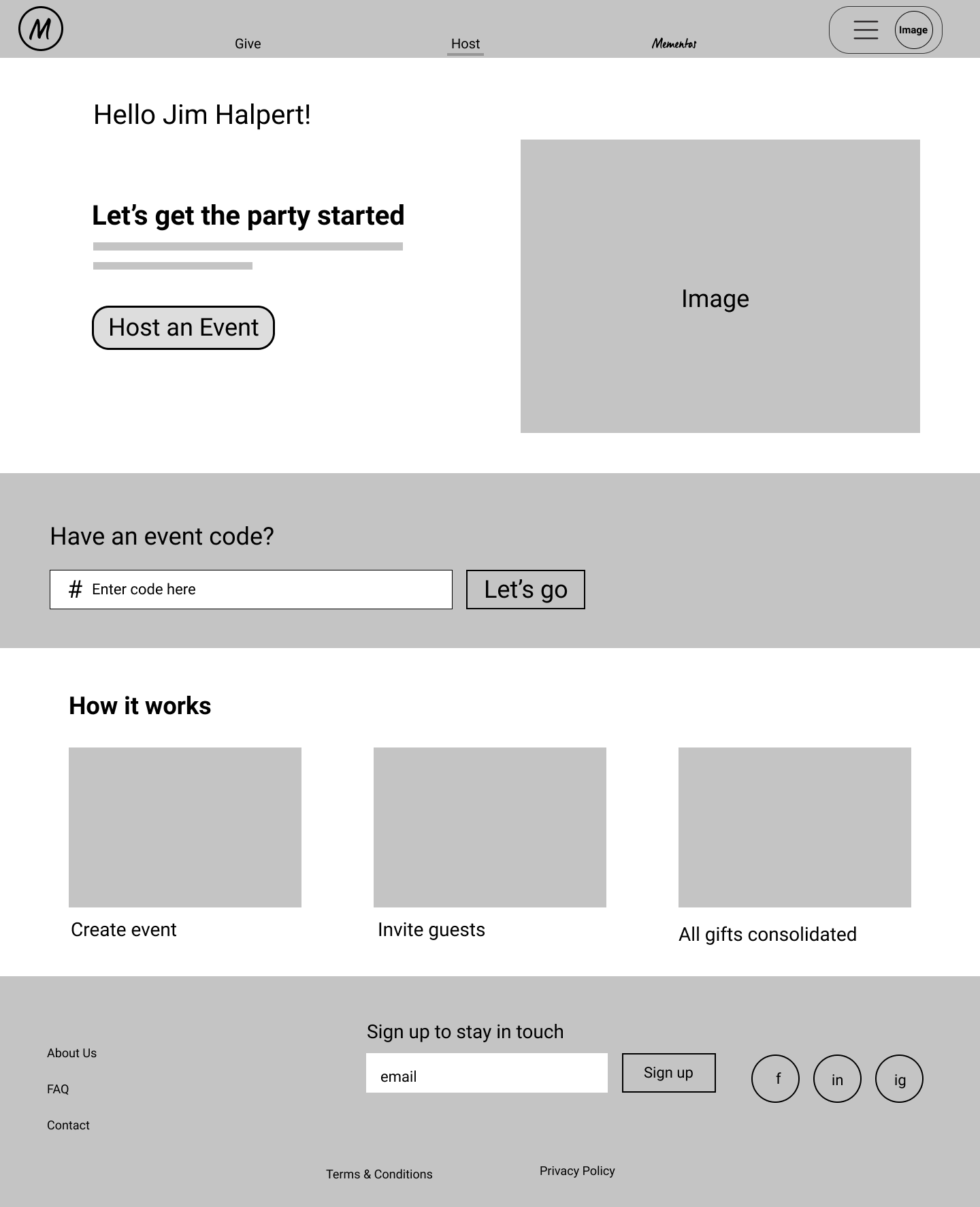
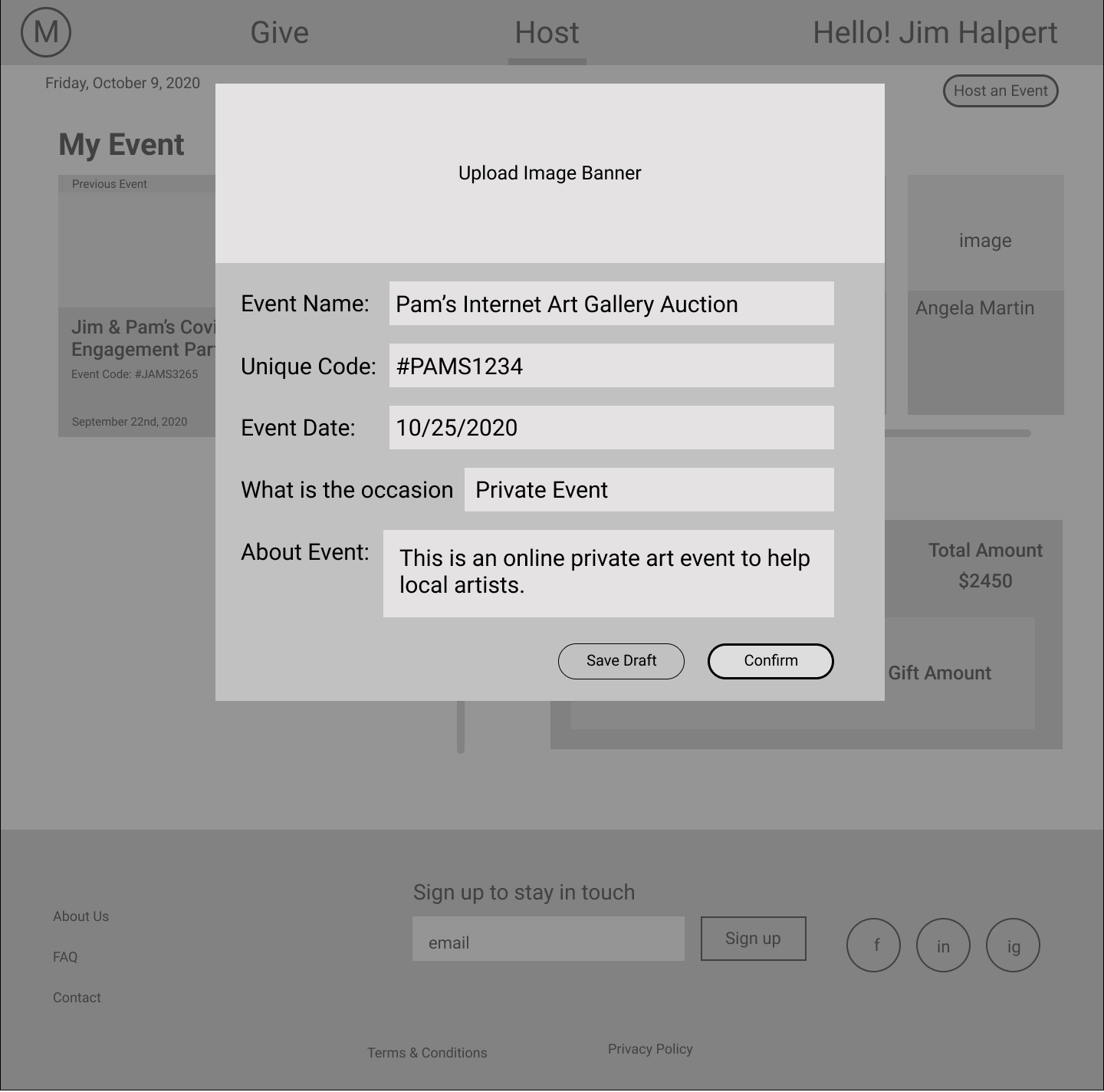
As a team, we collaborated in creating a set of low fidelity wireframes to focus on the user flow on sending a Memento and creating an event. We strived to have an intuitive and simple process for users to send their monetary gifts.
High Fidelity Designs & Prototype 1
Memento's Landing Page
We unified all over our different style tiles together to create a more cohesive desktop platform that still resonates with Memento's existing mobile app. The landing page focused on curating ideas on why sending a Memento would be a perfect gift for any occasion. We strived to great an intuitive straightforward design for users to easily host an event and send a Memento to their loved ones.
2nd Round of User Interviews
Purpose
9 participants were interviewed to test the usability & desirability of Memento's desktop browser prototype. Participants were provided the link to the prototype (InVision or Figma). Users were provided a few minutes to get familiar with the prototype before the interviewer asked them to perform 4 specific tasks.
Tasks
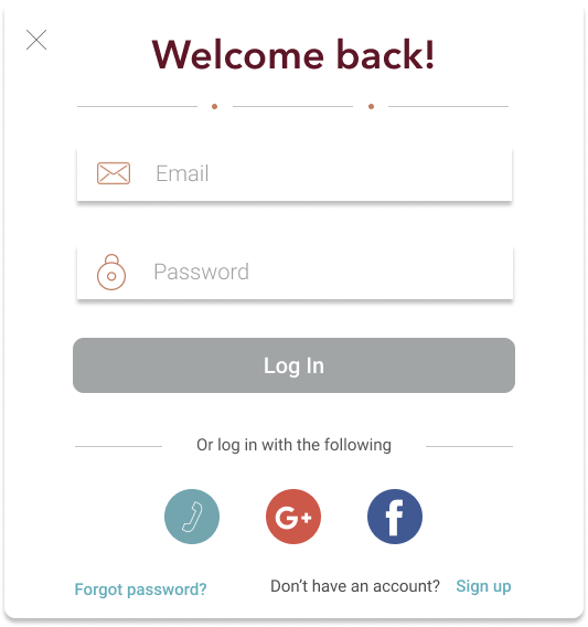
To look at the home screen and either log in or sign up
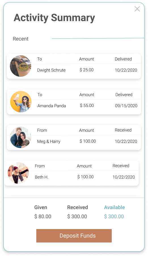
To create a Memento, and look at account summary
To create an event and invite guests
To browse the blog page
Overall Impression
The website felt professional, simple, easy to use, and not overly complicated
The photos used gave off the feeling of the importance of human connection
Words used to describe the design: Professional, Informative, and Sophisticated
Second Meeting with Memento
I conducted another workshop called I Like, I Wish, & What If to get a deeper understanding of our clients’ thoughts about our Prototype 1 design. They were pleased to see how the CTA buttons were sharp and easy to recognize. However, they wanted to explore more options on redesigning the top navigation menu and having the ability to message to other users.
I Like... ⇲
- How the team incorporated Memento’s images and branding
- The simplicity of the layout and the CTA buttons
I Wish... ⇲
- To see how the layout will look with more blog posts
- The transaction process was more clearer for the user
What If... ⇲
- There was a step-by-step guide to use the desktop platform
- We could send thank you notes when we receive a Memento
Last Round of User Interviews & Prototype 2
Purpose
To test the usability of Memento's desktop browser prototype. Participants were provided the link to the Figma prototype. Users were provided a few minutes to get familiar with the prototype before the interviewer asked them to perform specific tasks.
Tasks
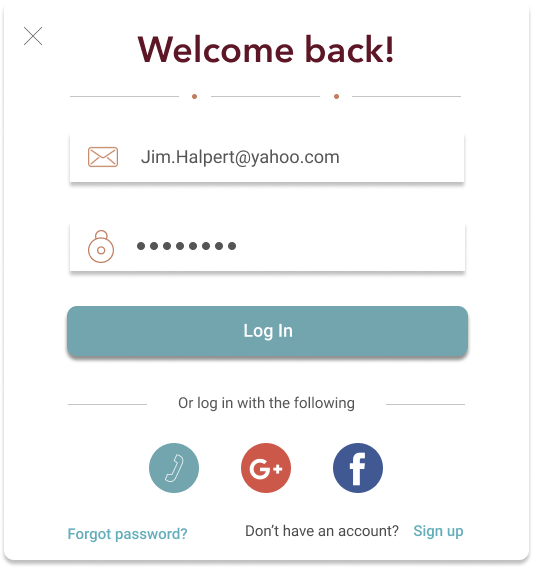
To create a Memento when signed in as Jim Halpert
To browse the About Us page & Profile page
To create an Event and invite guests
To create a Memento as a guest
Positive Feedback
-Users enjoyed the “Never Miss a Moment” feature on the homepage and they could scroll through the examples of ways to use Memento
-Users felt the flow of sending Memento and creating an Event were intuitive and easy to navigate
Needs Improvement
-Users wanted to be able to distinguish between the Transaction and Mementos gifted sections within the Profile
-Approximately half the users felt the Help section was useful. The other half felt it could use improvement
Comments to Consider
-To add more information surrounding security with money transactions
-Provide more clarity on how to use the Event code
Conclusion
After two rounds of user interviews, our design team were able to create a successful desktop prototype for Memento. I focused on designing the gift giving user flow as a guest user. As a team, we were able to work cohesively in balancing out the overall workload to ensure to deliver a finished prototype.


